Introduction:
Although there are other plotting libraries (I am looking at you Seaborn, Plotly, Boken etcetc), Matplotlib still remain the most widely adopted plotting library. The power of matplotlib lies in it’s simplicity for beginners yet its extensiablity using different APIs.
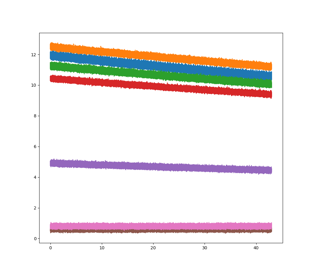
Let’s start with plotting our sensor data using vanilla matplotlib.

1. Adding Custom linecolors and Labels to the data
Colors add variety to the plots and help in separating and highlighting
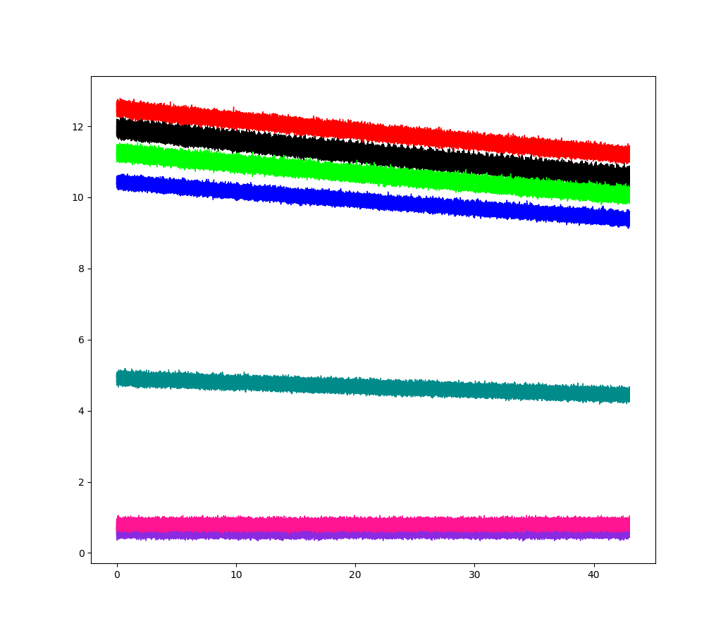
Although matplotlib has a default color palette, I need to change the linecolors in order to recreate the SciDAVis plot. You can find the list of supported colors on the matplotlib website ().
To define a specific color for the plot, I use a list of colors which I will pass as an argument to the axes.plot() method. This list_of_colors contains all the colors perfectely matching the linecolors in the SD plot.
list_of_colors = ['black','red','lime','blue','darkcyan','blueviolet','deeppink']
Next step is to add labels to the different lines. These labels are use to differentiate different lines and name them for the legend could either be picked from the pandas dataframe header names or can be explicitly passed in the axes.plot() method. I am going to use the second method to name the lines using a list of labels.
list_of_labels = ['Sensor S1','Sensor S2','Sensor S3','Sensor S4','Sensor S5','Sensor S6','Sensor S7']
2. Plotting with the new line colors and labels
Let’s use the predefined colors and labels to plot the sensor data using the axes.plot(). As I used two lists defining the colors and labels, we need to loop through these lists to pass them into the plotting function.
list_of_sensors = ['s1','s2','s3','s4','s5','s6','s7']

fig, ax2 = plt.subplots(nrows=1,ncols=1,figsize=(10.33,9))

for i in range(len(list_of_sensors)):
    ax2.plot(df['time'],df[list_of_sensors[i]],
                color=list_of_colors[i],
                label=list_of_labels[i],
                linewidth=1)
The above code snippet does the following:
- The first line defines a list_of_sensors which we need to plot the data using a single for loop.
- Next line defines a figure (fig) and axes (ax2) object.
- nrows : defines the number of rows (It is ‘1’ as we only need one plot)
- ncols : defines the number of columns (It is ‘1’ as we only need one plot)
- figsize : defines the figure size in inches
- The for loop loops for a total 7 times (total number of sensors) using the length (range(len)) of the list_of_sensors
- ax2.plot() is the main plotting function plotting the data on the defined ax2 axes.
- df[‘time’] puts the time on the x axis.
- df[list_of_sensor[i]] puts the sensor data on the y axis depending on where the looping variable i is.
- color argument picks colors from the list of colors and adds them to the line
- label argument picks labels from the list of labels and adds them to the line
- linewidth controls the width of line. (I am keeping it at ‘1’ otherwise the plot becomes too thick!)

3. Setting the x axis and y axis limit
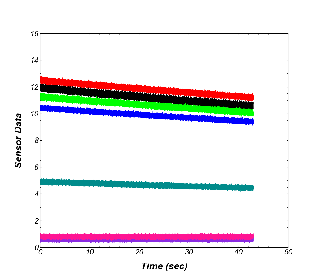
Matplotlib has an auto axis limiter which changes the x axis and y axis in order to center the plotted data. Sometimes this becomes a nuisance as the axes start and end at random decimal number. In order to define custom x axis and y axis limits we can use:
ax2.set_xlim(0,50,10)
ax2.set_ylim(0,16,2)
Very easy code isn’t it?
The first line sets the x axis to start at 0 and end at 50, with axis labels displayed every 10 units (0,10,20,30,40,50). The second line sets the x axis to start at 0 and end at 16, with axis labels displayed every 2 units (0,2,4,6,8,10,12,14,16). With these parameters we can set the axis to any desired limits and spacing
4. Setting the x axis and y axis labels
Vanilla plots don’t have the name of quantity being plotted on the x axis (Time) and y axis (Sample Data). To define the names/labels for the axes, we need to use the set_label function:
ax2.set_xlabel("Time (sec)",
                fontsize = 22,
                fontfamily = 'arial',
                fontstyle = 'italic',
                fontweight = 'bold',
                labelpad = 15.0,
                )
ax2.set_ylabel("Sensor Data",
                fontsize = 22,
                fontfamily = 'arial',
                fontstyle = 'italic',
                fontweight = 'bold',
                labelpad = 15.0,
                )
The set_xlabel/set_ylabel sets the name of the axis with a few arguments:
- The first argument is the name of the axes (“Time (sec)” for the x axis and “Sensor Data” for the y axis)
- fontsize controls the font size of the label.
- fontfamily controls the font family (serif, sans serif, cursive), or can also use the font name, like Arial, Times New, Courier etc etc.
- fontstyle is used to make words italic. It can take 3 values: normal, italic or oblique.
- fontweight is used to give thickness to the words. It can take 6 values: normal, bold, heavy, light, ultrabold, ultralight.
- labelpad is used to provide a small gap (in points) between the label and the axis.

5. Setting the tick labels
Tick labels are the numbers on the x axis (0 to 50) and y axis (0 to 16). To change the

6. Setting up the Legend
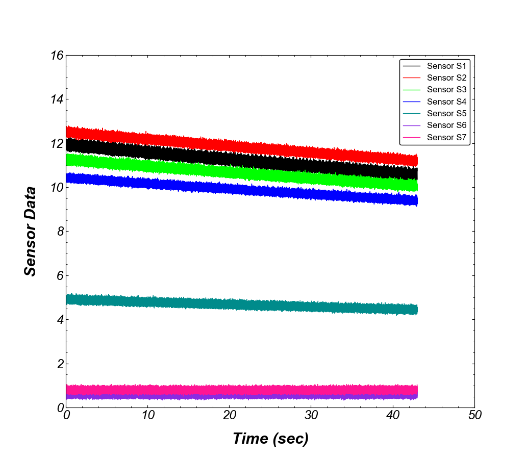
The figure is coming up nicely and resembles closely to the plot we are trying to recreate. The final icing on the cake is the legend, which contains all the names/labels of the data we are plotting. The axes.legend() function will look for the labels in the axes.plot() function (as defined in Section 1) and display it on our plot. To set up legend, we can use:
ax2.legend(edgecolor='black',
           prop = {'family' : 'arial', 'size' : 12},
           framealpha=1,
           loc=1)
This snippet enables the legend on the plot and uses the folowing arguments:
- edgecolor changes the color of the border around the legend labels.
- prop is used to control the font property for the legend labels. A dictionary containing font family and font size controls the font on the legend.
- framealpha controls the transparancy of the legend, with transparency decreasing in value from ‘0’ to ‘1’.
- loc controls the location of the legend. The default value for this argument is ‘0’ or ‘best’, and the function tries to find the best possible location for the legend. The other possible values are can be found in the official documentation.

The plot looks pretty much ready to be inserted into a journal publication, that you have been working on for a long time!
Next up, how to save these setting in a mpl file which you can call into your scripts to automate the editing of vanilla plots.